NEWS

Now featuring on Behance!

https://www.behance.net/gallery/22895285/The-Three-Project

Tuesday, September 30, 2014

GUESS?!! (2)

All THREE pictures for hint!!

(1) Three Rhythms with Three Different Pens


(2) 

oh la la, it's made with tape!


(3) A Splash of Red
Pick One out of the Six


The Three© Wall

SHOUT OUT TO MS. SLAUGHTER FOR BEING SO GENEROUS AND ENLIGHTENING & LENDING ME OUT THE WALL!! :)

I started putting my work on the wall today. Check out the pictures below!

The Wall in the afternoon. :) First look!

The Wall at night! With much more excitement!

A closer look at night :)

The Wall will be a great place for me to display my work and also play with different combinations and gain inspirations. I am truly grateful for such a wonderful space and am so excited!

Billiard II --> Three© #3 fresh off the studio!

Do you guys still remember our friend Billiard, one of my earliest production?

Here is it, back with its third illustration, and gladly becomes Three© #3!


Check out the third illustration below-
Complete with a HB pencil only. Concise, modern, and classy. :) Hope you like it!

Pencil leads the way! 
Simply concise, modern, and classy.

See, a stick and a ball in front, so many possibilities, so many uncertainties, yet so quite, so simply.

Billiard Three© Complete!

THREE© Friends


THREE© Friends


#1 A Chocolate Cake & A Cup of Tea

- Perfect Companions: On simply sweet, one a bit bitter. Both find home in each other. :)

Illustration I's colored pencil ensemble. :)

Everything is drawn with colored pencils except the red cherry on the top of the chocolate cake is by paint. :)


#2 Blue and Green

- Blue and green are two very similar yet distinct colors, and they go along side by side with each other. Aren't dear friends like this?

Paints- green(blue+yellow), blue, white


Mixing paint struggle for Illustration II. Getting the PERFECT green!


#3 Da

- Friends is laughing out loud.
  While "大笑" means laughing out loud, "大" charecter along means "big". Big hearty laughter with your homey friends is always a must have. :)
  The character also shapes like a person who is giving a big hug. The warmth of the color orange gives off even more friendship happiness.:)

Finally decided on using pastels (far right) for the illustration.


LOVED THE TEXTURE!!!

Tea Cup II --> three© #2

Crazily upside down. Perfectly tea cup. :)

I gladly announce that the tea cup triplet is completed today as well!!!

Check out the miscellaneous third illustration, and what are you thinking of?!


Start with multiple colored pencils- mainly warm colors.

Struggles on mixing the paint to get color purple.

The mysterious third one!

Tea Cup Three© Proudly Present

Tennis II -> serie complete

After my tennis game yesterday, I found my third angel for tennis--texture. The texture of the moment your racquet hits the ball.

It is different. Everytime. 
Sometimes you feel a hollow in the center of your tennis racquet and the ball flies back decently bouncy. 
Sometimes you try hard but the ball lands back quite shallow. 
Sometime you hit hard and you can feel the great strength band the ball is carrying attacking back.

So here are the three main textures.

Middle thickness Oil pastel for the decent regular hits.
Thick Paint for the powerful strong hits.
Thin Colored Pencil for the shallow weak returns.

:) Enjoy.

Green (the color of tennis courts and used tennis balls) Oil Pastel for the one middle thickness layer.
Green oil pastel II.

Mixing green out of blue and yellow paints.

Green Paint for the thick layer.

Yellow (the color of new tennis balls) Colored Pencil for the thin layer.

Yellow Colored Pencil II.

The Three Layer Family.


Tennis Three© complete!


Tuesday, September 23, 2014

Week Review

6:43 pm today, I talked into the art studio saying to myself, "okay, let's figure out my life."

It had indeed been a pretty rough week for me. Like many great businesses having to go through a life-defining hardship in the beginning, I had to face my own confusion and great desperation.

After the first week's fresh tryouts, I thought I had used up oil pastel, paint, colored pencil, and black marker's creativity quota by just experimenting with each of them once--I aimed to be BOLDLY NEW, didn't I? So on last Friday afternoon, I sat in the art studio with my headphones and surfed online to look for some creative inspirations.

I found some. I found too many. I lost focus.

What is my project? How am I going to achieve it?

Going back to the most basic proposal questions, I couldn't answer them this time.

I couldn't answer them in the next few days.

I couldn't because my head was exploded with big expectations. I wanted to define the world like the Noun Project did. I wanted to bring out a whole new holistic, perfect system on way of thinking life. I wanted to start off on a pre-paved road to success.

But my plan is not perfect by birth. My project is not world defining or objectively holistic. My road is not pre-paved and honestly doesn't have to be yet.


I didn't realized all of these until 6:50 pm today, when I sat down at the studio table and started experimenting with black ink.

I drew off my first pre-made idea- a dear desperation bottleneck. Then I stopped. I was stuck. Totally stuck. I was aiming to be rather productive tonight, but I couldn't think off my head a single idea on what to draw down with the black ink next. My brain was blindingly blank in this evening black.

Then I suddenly understood.
Out of helplessness. Out of desperation. Out of cumulative confusion.

I can only produce heartfelt symbols with heartfelt objects, those that have truly touched my life. I am not a mass producer, creating hundreds of pictures everyday. I can't. I take my time; I am responsible for my feelings, expressions, and the precision of production; I feel the life. And I can't define the world. I am not objective. I am not omniscient. I only know the sides the world turns itself on me, and I only feel the beats my heart chooses to dance along.

And it's okay.
It's okay to take my time. It's okay to not be holistically representative. It's okay to just be me.

Because after all, this is what started off my project in the first place, this is what I'm good at, this is what I can do, and this is my own unique style and inspiration spring.


I'm much less confused and much relieved and clear-sighted now. I'm no longer suffocated by my grand ideas. I know what I can and will do for my project now-- simply take the time to feel the life, and depict these enlightening moment with appropriate art techniques. Keep drawing small tokens with a big heart and ever curious perseverance. Moreover, experimenting with something once actually does not spoil its newness-- every new understanding and every deeper interaction with the technique gained along the way of practice are the ones that truly polish one's art skill and creativity shrewdness.
********************************************************************

So flowers bloomed from the embellished desperation bottleneck.

Wednesday, September 17, 2014

Chocolate Almond Croissant & Chai Tea Latte I

9/17/2014 Creation with a Pencil, Colored Pencils, a Brown Colored Pen, and a Ruler
It's a late-night greeting from Troy, NY. It is 11 celsius.
It is a recall of a warm morning.
It is a salut to brevity.


<CHOCOLATE ALMOND CROISSANT>
Chocolate Almond Croissant #1 Crispy
Using a 2B pencil and a brown colored pen, I tried to revive the crispy moment one bits into a chocolate almond croissant. The crispy croissant edge. The memorable combination of sugar and butter. The crispy satisfaction in a winter morning.

My last chocolate almond croissant was got last Saturday at farmers' market, where joy was blooming everywhere and there was nothing compared to a freshly baked good. The moment I held the croissant in my hand, I felt winter sun was melting right in my palm. 
I took a bit.
The crispiness. The crispiness.
The crispiness of almond sugar coating and pastry layers at that moment perfectly and holistically defined a chocolate almond croissant in my heart.

Colored Pencils
Using A Ruler for a Chocolate Croissant's Perfect Rectangular Sideview
Three Colored Pencils for a Imaginary Crescent-Shaped Croissant
Chocolate Almond Croissant #1 & #2 Views
How many of you have been like me, looking at a chocolate croissant and wondering why this cubic object is called croissant when it is not even crescent-shaped?
Oh well, then this picture is pretty self-explained.
I see a "real" croissant inside a chocolate croissant, and wonder what the rest mysterious parts are.

The interesting part of this creation was that in order to find the perfect color for the inside croissant, I had to corporate three different colors. Also, colored pencils have such delicate textures, that I could subtly adjust my power on my finger to help the three colors blend in the perfect way I wanted, leaving the cutting edges deep brown and puffy skins light orangish yellow.

Small. Centered. Iconic.

<CHAI TEA LATTE>
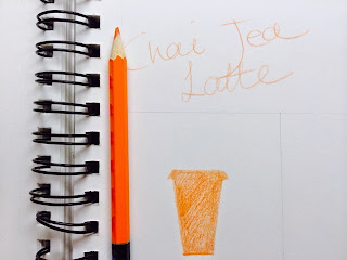
Chai Tea Latte #1 Full Orange
Filling in Color for Full Orange
There is nothing better in winter than to have a cup of hot Chai Tea Latte (with Soy Milk please) accompanying a chocolate almond croissant. At least for me for sure.
The color ORANGE fills my brain whenever I think of Chai Tea Latte, whenever I think of fall, whenever I think of liquid sunshine. There is nothing simpler in this world than a full orange cup to symbolize chai tea latte.

It is a cup. It is an orange cup always waiting loyally out there for you, to bring you warmth in a cold winter, to bring you comfort in a tough day, to bring you joy in a blank moment.
It is orange. It is warm. It is spicy.
It is as simple as a monochrome icon. It is as full and powerful as a monochrome icon.

It is Chai Tea Latte.


I found it rather interesting to work with colored pencils, because the way you fill in the color would affect the pattern and the whole image's flow very much. So for this illustration, I did some planning and used fast shuffling to create a fluent full feeling of the cup of drink, revealing its substantial warmth inside.

TO BE CONTINUED...

Saturday, September 13, 2014

Tennis I

miscellaneous color mix on the paper palette
Following up last night's paint experimentation, 2/3 Tennis was born after 2/3 Tea Cup production. However, instead of painting both of them like I did for the previous two Tea Cup illustrations, I only used paints for one of them, and explored the second one with pencil and black marker.

Are you ready?

Tennis #2 -Tennis, Sun, Love
> "It Must Be Love."
I went to my first US Open Tennis Championship in 2011, and the grand slogan that year has since made a hugh impact on my tennis career and life as a whole. It must be love. What else can it be? What else can ever build a champion, shape a player, pump a heart, and make every moment on the court a golden spark?

It is fall tennis season right now. Being on school varsity, I have been carrying this simple but powerful four words onto the court. Under the bright afternoon sun everyday, practice or game, I can feel the warmth of the sun melts into the flying tennis ball, as if the ball is the center of the universe, for this moment and for ever.
Whenever I lost myself on the court or was impatient or frustrated with the game, I reminded myself of why I was there playing- because I simply love the sport. So I looked beyond the fence for a glimpse of 5 o'clock sun and went back to the court with full passion to chase that one and only green sun.

Tennis glows with sunshine. It is a sun itself. It is own eternal token.
Tennis glows with love.


Experimenting marker-pencil combination.
> Experimenting with HB pencil and black marker, and two different sides of the black marker was such a whole different experience from color painting and other art tactics. It is simple, concise, yet inclusive of all the unwritten possibilities and powerful.

I chose it because the brushing moment of tennis playing is just this simple, yet fast and powerful. You pour all all energy into that one millisecond, one action, one wrist turning. You make your game compiling millions of this simple action. Brush.
Tennis #3 -Brush

Tennis preseason started on August 24 this year.

I remember myself being very scared and lost during the first couple days of practice. After seemingly endless discouraging falls and outs, I pondered if and how I had lost the ability and confidence to just simply hit the ball. To me, the only thing I could think of to focus on was the brushing moment when the ball touches my racquet.

Head down, focus on the ball, and brush. Thank you Coach Jack for this simple but truly helpful piece of guidance three years ago.

Head down, focus on the ball, and BRUSH. So I did it.


Today is September 13. A good three weeks after that first day.
If you ask any of my tennis teammates now about my playing, she would tell you one word- "LOBE." I do crazy lobes with my brushing friend. It's a gift it gives me, it's a skill I need to hone in on, and it's already one part of my identity now.

I'm picking up my tennis little by little. Though I've been the Lobe Queen for a while, I have started to pick up on my speed last week. Hopefully, soon I will be able to not only do lobes but also more crazily spun fast balls!!


Tennis is such a dear journey. I love it with my whole heart and soul. Let's get excited for the left mysterious 1/3!

Tea Cup I

First Paint Party of the year
PAINT.
Experiment of the day. I fell in love with it the moment I started mixing colors on the paper palette.
Paint's flexibility, tenderness, and substantial texture are beyond charming.

Welcome to the Land of Tea Cups!
Flowers on the Table. Flowers on the Tea Cup.
Tea Cup #2 - Rose Petal

2- ROSE PETAL

Close your eyes, and feel it.

A tea cup is like a petal, a petal of rose or of any summer flower one comes across. It is tender with its floral embroidery. It is delicate with its golden linen. It is petit yet glows with its own gleams.

Or is the petal actually, like one of friends pointed out, a lip print? Being left on the brim of the cup with a dear wish? Who left it there?

Savvy the past, holding a piece of art from mid-19th century Europe and bringing it closer to your lips. Savvy the moment- go on a date with yourself, tea, and the rose petal on your heart.

chrome it up!
Tea Cup #3 -Shades Down

3- SHADES DOWN

A sunny day, early afternoon, Tea Room.

Shades are down, reflecting the over passionate sunshine back into the back garden, leaving shades of light orange light dance through every other line. Here is a haven. Would you escape into a tea cup on one of those afternoons?

The horizontal lines on the top are the pulled-down shades, and the arcs on the near bottom part are where the end of the shade is hanging. Gracefully shaped like the ones under many french restaurants' outside drapes, the arcs have french styled refinement. This kind of color blue was right there on my mind when I had the design; it makes me think of Greek seaside, the azure breeze, and clean calmness.

Shades down. A tea cup is its own world. A tea cup is a dear dreaming haven in our little worlds.

TO BE CONTINUED...